Craig took these pictures, aren't they good? I made this as something to display for the store, using Teresa Collins paper and the tabbed covers. I am really proud of the way it turned out. I custom mixed the green color with the new line of Claudine Hellmuth Studio paints. They are easy to mix because it's basically half and half. I wanted a little more of an olivey color so I added red to the blue and yellow I already had mixed up. The glossy multi media is great to add a little less opacity to the color plus it's great to use as a glue. Just coat the back of whatever it is you're trying to adhere, press out all the bubbles, and paint the same stuff over the top. Very cool!
These are a couple of the inside pages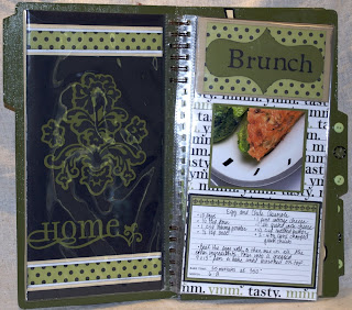 , I used the Cricut to cut the shapes and lettering. I used the Home Accents and the Accent Essentials cartridges for the shapes and Plantin Schoolbook for the lettering. Some of those Home accents shapes are pretty intricate, I learned that the hard way and wound up using the Scrapbook Adhesive brand adhesive sheets on the card stock before I cut it so I could just stick it down. What a pain to stick down all those little itty bitty bits otherwise. Anyway, it was fun to do and I guess enough other people liked it enough for me to teach a class on it in August! Wouldn't it be cool to do this kind of thing full time?
 , I used the Cricut to cut the shapes and lettering. I used the Home Accents and the Accent Essentials cartridges for the shapes and Plantin Schoolbook for the lettering. Some of those Home accents shapes are pretty intricate, I learned that the hard way and wound up using the Scrapbook Adhesive brand adhesive sheets on the card stock before I cut it so I could just stick it down. What a pain to stick down all those little itty bitty bits otherwise. Anyway, it was fun to do and I guess enough other people liked it enough for me to teach a class on it in August! Wouldn't it be cool to do this kind of thing full time?


.jpg)